Create a sense of place.
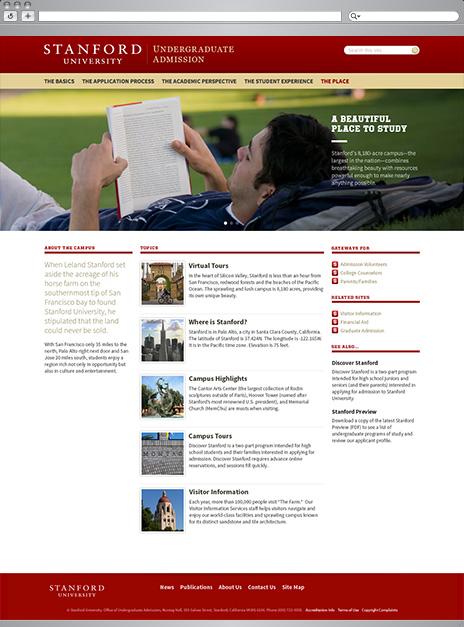
Stanford University is in a unique position: they don’t have to work very hard to sell themselves. As one of the most prestigious schools in the country, their reputation often precedes them. But that doesn’t mean the kids who want to go to Stanford actually know what it’s like. The new admissions landing pages are designed to offer a window into the Stanford experience.
The new experience starts with a video. The secondary landing pages feature rotating banners with large images and messaging. While the top of the page focuses on impact and emotion, the bottom half of the page focuses on the facts, serving the same audience at different points in their experience.
Visit the Site
