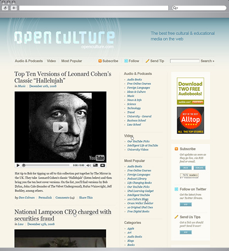
The go-to blog for open source education gets a complete redesign. When Open Culture came to us they had a respected blog with great content, but it was hard to read and difficult to get around. We started from the ground up, with a new grid, bold logo, fresh colors, and a clear hierarchy for text.
Add in some new space for advertising and a cleaned-up interface for subscribing, and you’ve got a recipe for growth. Powered by the easy-to-use WordPress system, Open Culture continues to share fascinating content with a confident new style.
Visit the Site
